
The Map And The Territory
how tools meant to guide can lead us astray

It seems like the apex metaphor in working with teams is that of piloting a ship. The British are seafaring people at heart, living on our little island. Our social reality has often relied on navigating the high seas.
Whenever we talk about steering an organisation, going ‘off course’, horizon scanning or ‘pulling together’ we are in a small way reliving the lives of our ship-dwelling cultural ancestors.
I want to explore an artefact of our nautical history that can offer a deep insight into the nature of tools and representations, and offer cautionary tales for how we use them with our teams.
Matt Turner shared a post on LinkedIn that I enjoyed this week -

In case you didn’t already know, the most common ‘map of the world’ is what’s called the Mercator projection. Google Maps uses it.
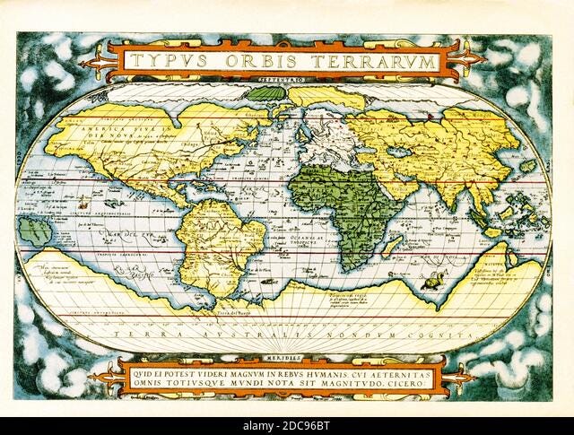
The reason for the weirdness of the circle around Paris in the image is that in order to make a 3D object (the Earth) fit onto a 2D representation (a map) you have to stretch and distort the landscape to make it fit. This lovely Vox video shows it better than I can. The Mercator projection makes the territory at the north and south poles appear bigger than they should be relative to other land masses, in order to emphasise another feature.
The Mercator projection wasn’t designed to be an ‘accurate’ representation of the earth. It was designed in 1569 to help sailors navigate more simply. With the Mercator projection a sailor could draw a straight line on the map - a ‘rumb line’ - and as long as they kept keeping the angle on the compass constant they could arrive at their intended destination.
Unless you were sailing directly West-East, or North-South, the Mercator would actually give you a longer route, but an easier one to calculate. The ‘Great Circle Route’ refers to the fastest route between two points but on the Mercator projection below it would be much harder to draw, and therefore to use in navigation decisions.

What about the fact that Africa looks way too tiny and Russia looks far more enormous than it is? Well that’s a side effect. Mercator was designing maps to make nautical calculations easier. He wasn’t trying to make the land masses appear at the same scale relative to each other.
It’s easy to criticise the Mercator projection and questions its status as the default map. It happens to make Northern Hemisphere countries look much bigger and more important. It distorts some countries in absurd ways (have a play with this tool). These problems have come from taking a tool intended and calibrated for one purpose and using it for another purpose without worrying about the side effects.
In a way this is a normal part of tool evolution. Adaptation and exaptation are normal and can be very beneficial. If these Mercator maps are ubiquitous and easy to mass produce, then sure let’s use them for other map-related things. This is a sensible strategy until the maps start misleading you. It’s easy to forget that the map is not the territory.
What’s interesting to me about this is how common this pattern is in other parts of our lives. As an example, any organisation that runs on emails is essentially taking a technology designed to replace ancient letters and using them to handle mass-communications and coordinations. No wonder Slack and Teams and other forms of team communication have abounded in recent years as alternatives.
I challenge you to think of a problem in your organisation and see if this pattern is at play? Which meetings, tools, processes or rules that were really good at solving Problem A are being used to solve Problem B at great cost?
If you enjoy Agile On The Mind please consider supporting with a voluntary paid subscription. It helps me continue this work helping people to build intelligent teams with the help of cognitive science.
Enjoyable read...but no mention of the Dymaxion/Fuller projection, here or in the video.
e.g. https://scrum.academy/lib/beyond24.jpg
I've heard that if you cut it out and fold it, it will resemble a sphere. Never tried it though.